Web Design Mistakes to Avoid When Designing Your Site
Let’s look at some common web design mistakes to avoid to keep users happy and have a more effective and converting website.
One way to think of your website is as the face of your brand to your online audience.
You want to make a good first impression on your readers and/or prospective customers. But unfortunately, a bad website with no optimization and serious design flaws will likely create a poor user experience for your audience.
Web design mistakes to avoid when DIYing your website
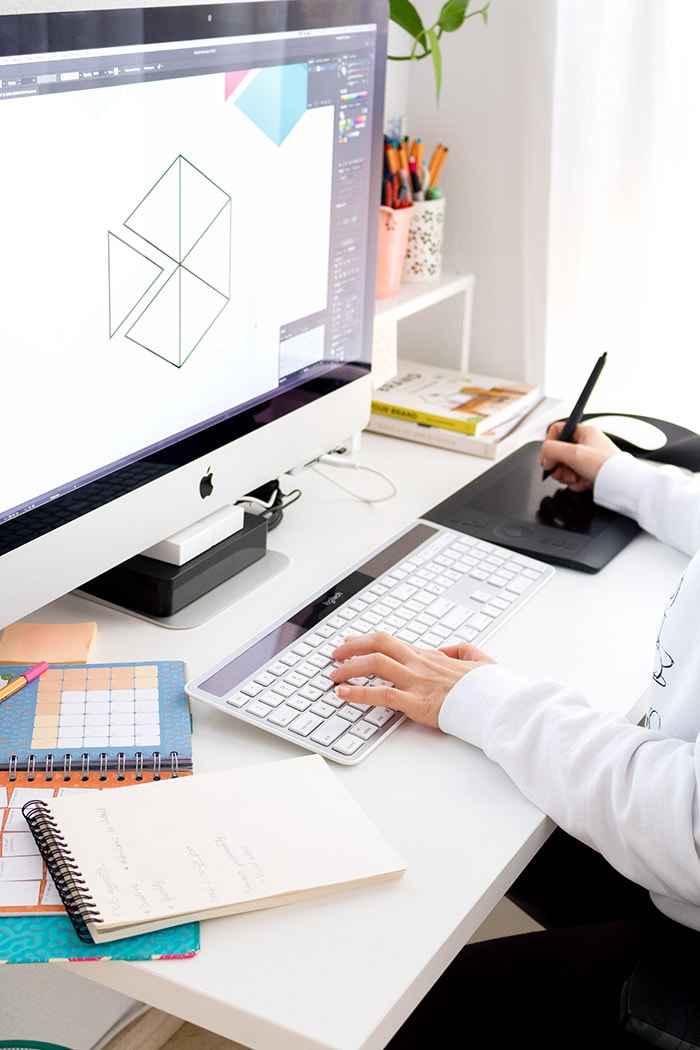
A common practice these days is DIYing a website. If you are starting a business you probably know you need a website, but maybe your budget is low at the moment and doesn’t give you the opportunity to get a custom one made. Then creating one yourself is a way to get your website up and running.
While going this route may seem the quickest solution, if you have no knowledge about websites, coding, SEO, optimization, it may take a while to get it done and it’s also very easy to miss certain details and elements that can give away the fact that you’ve self-designed it over going the custom route.
In this article, I want to mention some of the web design mistakes that I see often on many websites and blogs so you can void them.
Some of these mistakes you could say have a pass because they only affect the web aesthetics (which is also important), but there are others that affect the user experience, loading speed and even SEO.
I have made a list of common mistakes in web page design that are most often seen
- Use of low-quality, pixelated or distorted images
- Unreadable typography
- Use of justified text on the web
- Wrong use of Color
- Complicated navigation
- Incorrect use of whitespace
- Pages with little content that do not contribute much
- Using heavy images
- Not paying attention to the mobile version
- Adding too many animations and effects
- Slow Load Speed
Use of low-quality, pixelated or distorted images
This is a very common error that I have come across on many websites. Users find it unattractive and undoubtedly it’s one of the errors that hurts the aesthetic of a website the most.
The solution to this is very simple, you simply have to use images that are bright, sharp, and at the right size and resolution for the section of the site in which they are going to be placed.
If the image is going to be used as a full-screen background, it should be larger (in size and at 72 dpi) than if you were using it for a featured image of service or blog post.
Unreadable typography
I don’t usually find this type of design flaw, but I have seen some blogs that have chosen to use a slightly unusual typeface that is not very legible. For example, “script” or “hand draw” fonts are not very easy to read.
They can be used for a heading or subheading, but for the text of the body it is not recommended.
The size of the text is also important, according to Google the minimum recommended size for the text is 16px and the ideal should be around 18px. Although that also depends on the type of font you use.
Justified text on the web
Justifying the texts is another of the mistakes that is made in many websites and blogs.
It is something that is often done in print, but in the digital world it is not friendly
The readability problems caused by justified texts in paper format are corrected manually by an editor before publication using layout programs such as InDesign.
On the web, this is not possible, at least not right now.
Why should the texts on the web not be justified?
It is a subject on which there are many discussions because there are people who still determined to justify texts on the Web. Which in my opinion is a fail in design.
Some of the reasons for not justifying the texts:
- Rivers of blank spaces show up creating inconsistency in the text.
- It is more difficult to follow the lines because you get lost in the benchmark.
- They require greater effort and concentration.
- It is even more difficult for dyslexic people.
The texts are usually justified in paper format, but there they apply a series of techniques to correct the problems mentioned above.
Wrong use of Color
This type of mistake is more common than it may seem.
One of the most important web design decisions that you will ever make is choosing the colors for your website (and probably for your whole brand).
Choosing the wrong colors will hurt your site’s user experience. For example, if you choose several bright colors that clash with each other, it will distract your visitors from the content on your site.
Avoid using colors that are too strong or garish as these are quite tiring for your eyes and even annoying for reading.
Also, if you use a light colored type font and dark background color, unless you’re making a statement, your visitors will have a hard time reading your site’s content.
Imagine reading a long text with this color. Isn’t it nice?
But you should not go to the other extreme and use very pale colors either.
Sometimes I come across websites that had a very light gray text color that was hard to read.
For body text and headings the best to go for shades of black or gray. Although you can also highlight a word with color when needd.
Most importantly, bad color choices can hurt your site’s overall theme, brand image and subliminal selling value.
In short, you want to select colors for your website that embody your brand, are aesthetically pleasing and work well with its theme.
So here are a few things to avoid:
- Use of too light colors for body text and headings.
- Using vibrant neon colors for texts.
- Use of bold and strong color for body text background.
- Using bright bold background color with a vibrant competing colored font.
- Use of way too many colors at once.
It is important that the navigation of your website is simple and intuitive so that users can easily understand and access any part of your website with a couple of clicks.
In small web pages there are usually no such problems, but in webs that have many articles, services or products it is more common those complicated navigation systems.
If this is your case, my recommendation is that you avoid putting all your services or products in the same menu tab so that it does not become too long and overwhelming.
I’ve seen websites that when you go through the services section, a list is displayed with more than ten elements that sometimes don’t even fit on the screen.
To simplify navigation, what you can do is create a services page and from there link to all services or even create several categories of services or products
I also recommend that you review the pages of your website and see if you can combine some of them into one.
Incorrect use of whitespace
It’s a mistake made by many users who are not familiar with web design.
They try to highlight all the services, products and offers in a reduced space so that the user who enters does not miss anything. This is really not very positive, because it saturates the user with information.
Giving white space to the content of your website makes it easier for the user to focus on a clear call to action and go to the part of the website that interests you the most.
In addition, blank spaces help reading and browsing the web with ease.
Using heavy images
Undoubtedly one of the most common mistakes among new users, is uploading images to the website without reducing their resolution and weight.
Heavy images are one of the things that most affect the loading speed of a web page, therefore the user experience.
So it is very important that you resize and optimize the images for the web before uploading them so they look professional and yet fast to load.
Not paying attention to the mobile version
Most of your website’s traffic will likely be from mobile devices. Stats show that 80%-90% of all online users own a smartphone and browse on them. Therefore, your site must be mobile-friendly to guarantee your audience will want to see your content.
However, a responsive website does not necessarily mean that the content is viewed correctly on mobile devices.
It’s always important to make sure to check that all the pages of your website look good on mobile because, although your website might be responsive, there are certain elements that are out of square or look meh because they use the styles of the desktop version that don’t play well on mobile.
What I usually fix, is the size of the headings, the spaces between content sections and the order of the columns.
If you use sliders on your website, check that they look good because they are often quite problematic on mobile devices. However I always recommend not having slides at all as they slow down websites.
Google offers a free tool that will rate your site based on how mobile-friendly it is.Take Google’s Mobile-Friendly Test to find and fix other unfriendly features.
Adding too many animations and effects
Adding some animation and effect to certain elements of the wheb is fine, especially homepages or sales pages, but you shouldn’t go overboard either.
It is annoying to browse a web where everything moves or changes color when you hover over it. Although the number of animations is debatable, if it fits your needs, by no means add effects but always have a purpose for them and the least invasive possible.
In addition, it is something that distracts the user and can also affect the loading speed of your website.
Slow Load Speed
Along the same line as having a poor mobile experience, one of the biggest website design problems that leads to a major technical SEO issue and frustrations among website visitors is a slow-loading website.
The longer your website takes to load, the more likely it is that visitors will leave because they get tired of waiting for it to load and likely will never return
The culprits?
More often than not it will be either:
- Lots of images with huge file sizes
- Huge video files
- Ads from non-reputable sources.
- Every element on your website having an animation
Not only will your visitors be frustrated by a slow load speed, but also, Google will penalise your site with a lower search ranking.
So, before you upload any images to your website, check the dimensions in pixels either in Photoshop or your preferred app (aiming for the width size of your available visible area), save them as JPGs which tend to have a smaller file size than PNGs, then run the image through an online compressor to make sure the file size is 500kb or less without ruining the image quality.
If you are a WordPress user I love using the ShortPixel Image optimization plugin! I’ve used it for over 3 years and so far I’ve got great results. *This link is an affiliate so if you signup, I get a small commission.
You can find free website speed tests online to test the amount of time it takes your site to load. Most of those free tests will also offer tips to optimize your site for faster downloads. My recommendation is to never obsess over these numbers and metrics, just use them as references to fix and optimize what is within your reach.
Well, here is my list of web design mistakes that I usually find the most critical from my point of view and based on my experience.
I’m sure there are some more that could be added, so if you have any suggestions for my list of design flaws, you can leave them in the comments.
Thinking about a redesign?
Let’s Talk
I hope you find it useful. If so don’t forget to PIN and share it with friends!
If you liked this article, you might also love these too: