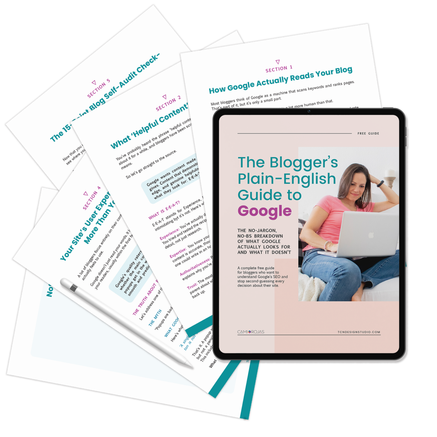
Blog Design: 15 Tips to Look Beautiful even on a Budget.
I’ve been blogging for over 8years now and working on blog design for about 7 and I still keep learning new things every day. That’s kind of what I like the most about blogging.
There is one thing that I’ve learned and I particularly think it’s very important: the blog design really matters!
The blog atmosphere and overall look is really important and is what makes readers feel like home while they are on our blogs or run away and never come back.
We want readers to come and feel comfy, don’t we?
Without readers what’s the point of blogging at all, right?
So I’m sharing today a few tips to show you how to rock your blog design on a budget.
15 Tips to Have a Beautiful Looking Blog Design even on a Budget.
When I talk about a blog atmosphere I talk about having a blog environment that is relaxing and inviting. A place where everything is easy to find and readers can navigate naturally feeling that they want to come back for more.
Want to know a secret?
The truth is that you don’t necessarily need to spend a lot of money on designs in order to accomplish a beautiful-looking blog design. Looking for professional advice and expert designer is always the best bet but when the budget is tight there are always ways to achieve a great design on your own.
You might be asking, Do the pre-designed templates provide the look I need??? Is it possible to have a professional blog design without a designer???
The answer is yes!!!
If you are starting and don’t have a budget to hire a professional web designer (which is always the recommendation), you only need a few tips to implement, take the time to see as many free templates/themes as you can.
You just need to choose a theme/template that you really love {basically aim for the cohesive structure of the layout, sidebar, header, footer style/position}, do a few tweaks and reorder your site’s elements and you are good to go.
I’m sharing some really important tips here so you can make the most of your free (or inexpensive) theme.
When you are searching for themes, make sure you get these features:
- It’s 100% responsive; nowadays, mobile-friendly themes are a must. Google now takes that in high priority to allow you to rank better. If the theme you absolutely love doesn’t have this feature, then consider a mobile plugin.
- Customizable. There are themes that allow you to customize many things like, fonts, colors, backgrounds… Try to use them.
- If Content is King, Minimalism is the Prince. Clean, fresh, bright websites do better. They provide better user experience because it doesn’t overwhelm readers.
Did you know that you have 3 to 5 seconds to make your first impression?
Yes, that’s true!
So, that’s the big why the design of your blog matters a lot more than you think. You can write a great article but if your website looks like crap, it’s messy, and overwhelming, chances are, you readers will leave without blinking and will most likely never come back.
But Hey! Of course, the design won’t replace the quality of your content. Content is still king and good quality is a must if you want to make readers stay and come back for more.
The design is the first impression and the hook; the content is what makes them loyal and returning visitors.
Your number ONE goal with your blog and design is to provide your reader with the best user experience you possibly can.
So, let’s dive into how your blog can look great!
Tips for a Beautiful Looking Blog Design
1- Having a clear and organized blog structure.
This is VERY important: Header, navigation menu tabs, Post Column, sidebar column, and footer. Avoid too many distracting things.
2- Choosing the right Colors.
Believe it or not, colors is one of the most important things on our blogs. It’s actually the very first thing that pops up when you land on a blog. As a graphic designer I had to study the psychology of colors and it definitely affects people’s behavior.
Dark and strong background colors make the space seem saturated; it squishes the posts and makes people feel trapped. It also makes reading heavier and stressful. Dark means lack of light so a dull blog is not very comfy to spend time on.
Choosing the right colors for your site is more than just picking a few favorite colors and adding them in. Colors should match the mood of your brand, logo and site purpose. Combinations should be well thought out.
The best colors for site backgrounds are the lightest ones. We can use patterns, textures, whatever we want but keeping the shades very light. My personal choice and advice will always be white.
My style is very clean but it didn’t start that way. I started with a light violet and after almost a year I figured that my blog wasn’t very inviting, people used to say it was cute but hard to read. My numbers got better after I changed it.
White is the perfect color for the post-column since it will contain text blocks and images and we want people to focus on the content and not getting distracted. It centers the attention of the readers on the reading.
It’s recommended that the content width shouldn’t be less than 650pxl and not more than 750pxl. A too narrow column makes te text blocks look squished and long. If it’s too wide, it makes lines of text too long and it gets annoying to read.
Content text color shouldn’t be back 100% the perfect shade is 85% black (anywhere between hex colors #333333 and #666666) against a white background. It seems silly but it’s true. When you have STRONG full black texts against a white background, the eyes get tired easily. It’s a very harsh contrast for the human eyes.
In general, it’s best to keep it to a 3 color palette for your site besides black, grey and white. Any more than that might make your site to look chaotic.
Choose colors that reflect the “feel” of your site, colors that are appropriate for your audience and that goes with what you share.
I love using this site for palette combos. I never use all six colors they offer on each combo but I do use 2 or 3 for each design I make. Check it out! You will see they categorized the palettes so if you will surely find the right palette for your niche.
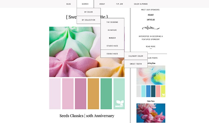
For example, if you are a food blogger that shares mostly desserts, a good palette might be shades of brown and pink.
With colors you can evoke emotions, so use this to your advantage.
Bright and strong colors are good to attract the attention to certain things such as the tabs, blog name/logo, sidebar titles, post titles, illustrations, etc.
On the extreme contrary, TOO much white is clean but it could be also boring without some accents and points of attention such as those I mentioned.
It’s all about balance.
3- Fonts are everything.
Fonts are the base of good design and using different fonts is a wonderful way to make your site more unique. But figuring out which fonts to use and combine with is the tricky part.
There are SO MANY fonts!.
The thing is that we can’t have them all on the blog as much as we love them. 3 fonts is a good number.
What I usually recommend is that we use 2 on our blog name/logo, combining a serif font with a sans serif or cursive/handwriting font and then a 3rd one for the post body texts.
Serif fonts have serifs or little extenders or “feet” sticking off the edge of each stroke. Serif fonts are almost always used in print (books, magazines, etc) and have always been known as comfortable to read with a classic look.
Sans (without) Serif fonts don’t have the little extenders sticking off the edge of each stroke. Sans serif fonts are common on the web and they feel more contemporary and modern than serifs.
The body text font should be plain, simple and easy to read.
I love using one of the fonts from the name/logo for titles and headings. If you know how to change fonts on your theme that’s a great practice. That way you have a coordinated and consistent image throughout the whole blog.
Also, choose fonts that have the right “mood” for your audience, that go well with the nature of your content and most important make sure your fonts are readable on mobile devices too.
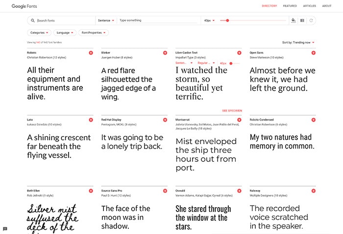
The best place to get free web fonts is Google Fonts.
4- Clean Header.
“The cleaner, the better”.
A sweet composition can make a great difference. It should contain the blog’s name easy to read, a description {what is it about}, social media and maybe an opt-in box subscription above everything.
I usually avoid crowded backgrounds in the header to allow people to easily identify the blog’s name.
It’s recommended by many established bloggers {and it has worked for me} to have the social media buttons and the subscription there because it’s one of the first things visitors can see and easily follow. You can also have it further down on the blog sidebar or in the footer and even on the bottom of each post if you want.
Keep in mind that people don’t like to look for things on our blogs and if they don’t have the important elements handy they might like your blog but they will leave without following.
One of the most common mistakes I see is adding way too many items that end up creating a 2-rows menu. This makes your site look newbie and disorganized.
Even though you need to make it easy for visitors to navigate you don’t have to have it all shoved in the navigation menu. The best practice is to categorize it and show only the most important ones at the top level and the rest as dropdowns.
For example, If you are a lifestyle blogger, you can specify your main categories like Travel, Fashion, Gastronomy. Then any category related to those main categories would go as dropdown menus. Also, try to use the least number of words for Menu Tabs unless you have menus like mine broken in 2 lines.
If your theme happens to have 2 navigation menu like my site. One at the top and another one after the header, you can make the most of it. You can put all the important pages at the top, Home, About, Contact, Legal and then your main categories on the secondary menu.
I always recommend to keep it simple and organized so your navigation always looks neat and within one row.
6- Pretty Headshot for Profile Photo
Have a bright, good looking (avoid photos of your last vacation on the beach) and fun Profile Picture.
As bloggers and readers, we love to connect with people, give a face to the voice of who visitors are reading from.
Mentally we imagine the person talking to us so the best way to welcome our readers is having a nice photo of ourselves first thing on our sidebars when possible.
You can use your favorite image editor to add frames, or some decoration and even text if you like. Just make it feel like you!
7- Make a Simple Homepage.
Set your homepage to display no more than 6-8 posts per page when you feature big images, or 8-10 if you use small images with excerpts. That way your blog is not crazy long and easy to navigate.
I’m a crafter so I like my main photo to be BIG LOL. But I’ve learned that in order to have an organized and SEO friendly home page is best using small images with excerpts. This gives readers an overall idea of what your blog has to share.
One good tactic is having a theme with a feature post (big image + excerpt) and then the rest with smaller image + summaries.
The number of posts on homepage and archives can be set up on your dashboard >> Settings >> Reading. If you are like me, then that’s a good number of posts per page.
8- Never use full posts on homepage.
The best practice is having one featured image, title and an excerpt of the content to attract the attention of your readers. You can also add a “Read More” button.
Usually, that is something you can set up on your WP settings and on your theme. But is best if you find a heme that is already designed that way.
Sometimes the posts are very long, like tutorials, we have to scroll down so many times that we usually don’t get to see the older posts which is not good and that helps increasing bounce rate too.
9- Minimalist Sidebar.
There is no magic number for how many widgets you should have, but keep in mind that they not only clutter your site but slows your page loading time as well so every single one should be serving a specific and functional purpose.
The least the better is the rule of thumb here.
Those that are important, keep them as close to the top as possible such as profile picture, search box, and opt-in box if you have one.
Make widgets titles easy to read using clear headings or image headings above each widget to identify them. You can also use borders and/or backgrounds to visually separate them.
Avoid linking to targets that make reader leave your site to someone else’s sites. Remember that you want your visitors to stay as long as possible in your site. Offer information and links that will invite them to click and read more of your own content.
Also avoid any feed plugin in the sidebar, like Facebook, Twitter or Pinterest. Those slow down your site, take up a lot of space, and honestly, nowadays nobody pays attention to that anymore.
10- Gorgeous, bright, sharp PHOTOS.
Your photos are more often than not your hook. A good photo of your work can keep readers sniffing around on your blog longer.
Bright and sharp pictures are a must. Dull or dark photos push away your readers. Avoid bright borders or strokes around the photos it totally disrupts the image style.
Also, avoid using dark fonts on dark backgrounds or light colors against light backgrounds when adding titles to your images. When that’s the case use a faded white/black/color ribbon or label.
It’s good to use colors that are already present in the photo when adding titles. It can be in different shades if you like. BUT NEVER EVER use competing colors as backgrounds and text.
For example: Never use a blue background with yellow text or vice-versa. Or red backgrounds with neon green text.
Seriously!
That totally hurts the eyes.
Your best bet will be using white text on any tinted color background and any color text on white or really, REALLY light backgrounds.
Create nice compositions with props and details. Sometimes in food photos as an example, a napkin and a spoon or a glass can make a difference. We should take the photos imagining what we would like to see as a reader/visitor.
Use natural light as much as possible. Don’t take photos at night with your regular home lights or flash. This is such a huge mistake and people won’t want to share or stay long enough to appreciate the content.
11- The titles and headings should stand out and bring the readers attention.
Choose a color that is part of your brand (logo) or a pretty font making sure is bright and easy to read.
12- Break long paragraphs into smaller ones.
Reading very long paragraphs (4,5,…10 lines) gets tiring and makes people scroll down too quickly.
Lines can vary from one font to another. Round fonts are wider so lines end quickly making paragraph look even longer. I think 2-3 sentences/ideas in one paragraph is a good number with some exception, of course.
Nowadays, with so much people using their mobiles, it gets even more important to have short paragraphs. In different devices, you will get different paragraph lengths. Keep this in mind while writing.
These are perfect because you can set them up with your brand colors which makes your site coherent.
I recommend having them really visible and easy to share. We don’t know what social media visitors can have so just make it simple for them to share your content if they loved it.
Don’t expect visitors to have toolbars for every social media so just leave the sharing buttons at the end OR beginning of your post and enjoy the benefits. Don’t overuse them.
Floating Social is the best!!! Are perfect to have inside posts! If you don’t have it you would be losing many great opportunities to reach more people.
BUT choose wisely. Sharing buttons usually take up some loading time, so do some research first, check ratings and reviews. Among the free ones, I recommend using the ones recommended by known bloggers that claim them to be lightweight and customizable.
14- Don’t overuse Ads.
Ads are necessary for most of us but it doesn’t have to mess with our website look. You can always place them in good places and still keep your design clean.
Aim for good Ad Networks. There are great ones that focus on user experience and manage high-paying advertisers, so you can use less units and still make good money. AdThrive has been by far my favorite Ad Managing Network.
When we have way too many ad units, especially the pop-ups, visitors run away as quickly as they land on our websites. So be wise about this and always keep your visitors and user experience in mind when adding Ads to your site.
Banners can be placed on top of the header or below. Personally, I don’t like ads right inside the header, like next to the logo. But this is something about the taste and not a rule of thumbs, however, it can make your header look too crowded.
I personally prefer ads before the header or after.
On sidebar make sure to spread them so it’s not so overwhelming for your readers. A good number is around 3-4. Make use of Sticky ads.
I personally don’t like ads inside posts but I have them (a necessary evil), I make sure they are well spread along with the post so it doesn’t interfere with the reading flow.
15- Keep it Simple.
Wrapping up…
The key is to keep you design simple, clean and fresh.
You don’t need to spend a lot of money to have a pretty blog and you don’t need to to fill everything with graphics to feel it’s designed. Sometimes less say a lot more.
At the end of the day what you want is to attract visitors and make them feel comfortable and focused on your content.
Blog Design Tips Recap:
- Clear structure and navigation.
- Choose the right color combo for your brand.
- Choose the right fonts.
- Keep a clean header
- Simplified and optimized navigation menus
- Have a bright clear profile photo
- Simplified Homepage
- Image + Excerpt post on the homepage.
- Clean Sidebar
- Good quality photos
- Clear titles and headings
- Short Paragraphs
- Use customizable sharing buttons
- Don’t overuse Ads
- Keep it simple
That’s it.
Following these simple tips, your readers will feel comfortable as your guests, will stay longer and most probably they will come back looking for more if they love your content.
Hope this post helps a little bit. I would love to hear from you soon. What do you think? Do you have any other tip to add that I might have missed??? I’m always open to learning new tips!
Thinking about a Website Redesign?
I’m your girl, let’s Talk!
Great post, I’m pinning for later, to use as a guide to improve my blog! Thank you!
Thank you for the pinning!!! I’m glad you found this article helpful.
Let me know if you have any question or if you need any help!
Hugs
Cami